A NEW CHAPTER
Ahead of the 2025 season, we’re proud to unveil a refreshed identity for Sutherland Sharks FC—a bold new look that honours our 95 year history while paving the way for an exciting future.
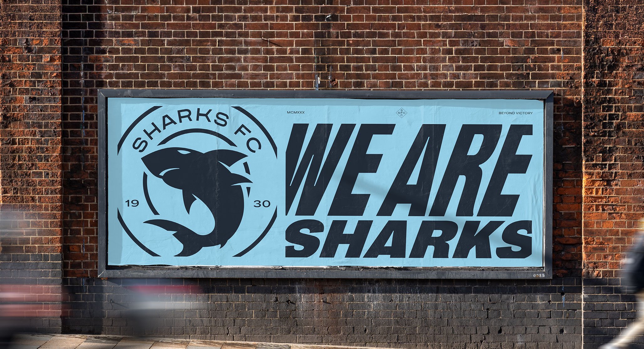
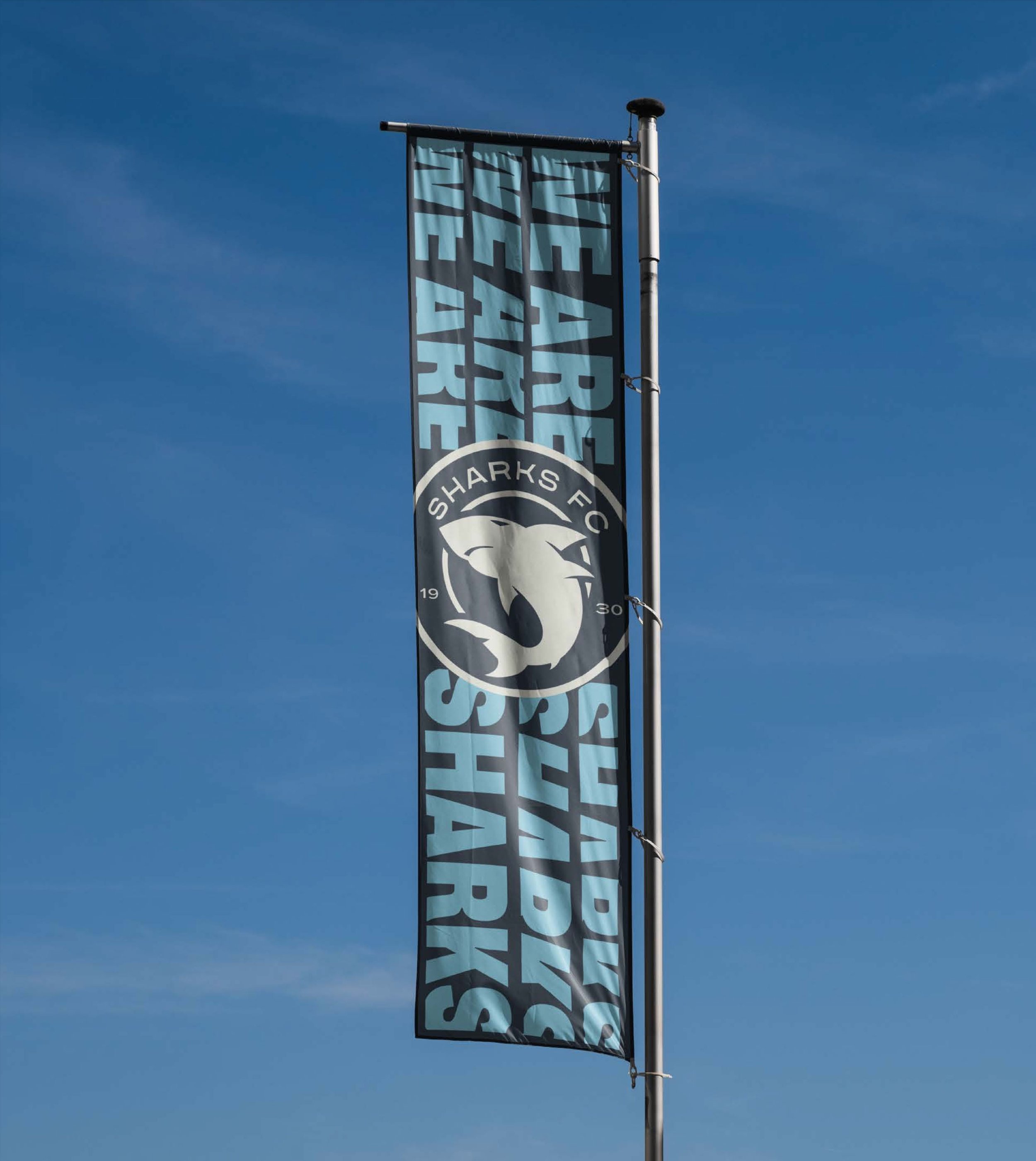
Our new logo
The Sutherland Sharks FC logo has been refreshed with a cleaner, more modern look. Subtle updates make the shark emblem sharper and more dynamic, with the addition of our founding date of ‘1930’ recognising our long, proud history. Our colour palette remains bold, drawing inspiration from the ocean and our coastal roots, while the updated typography brings a fresh, contemporary feel that reflects the club’s energy and ambition.

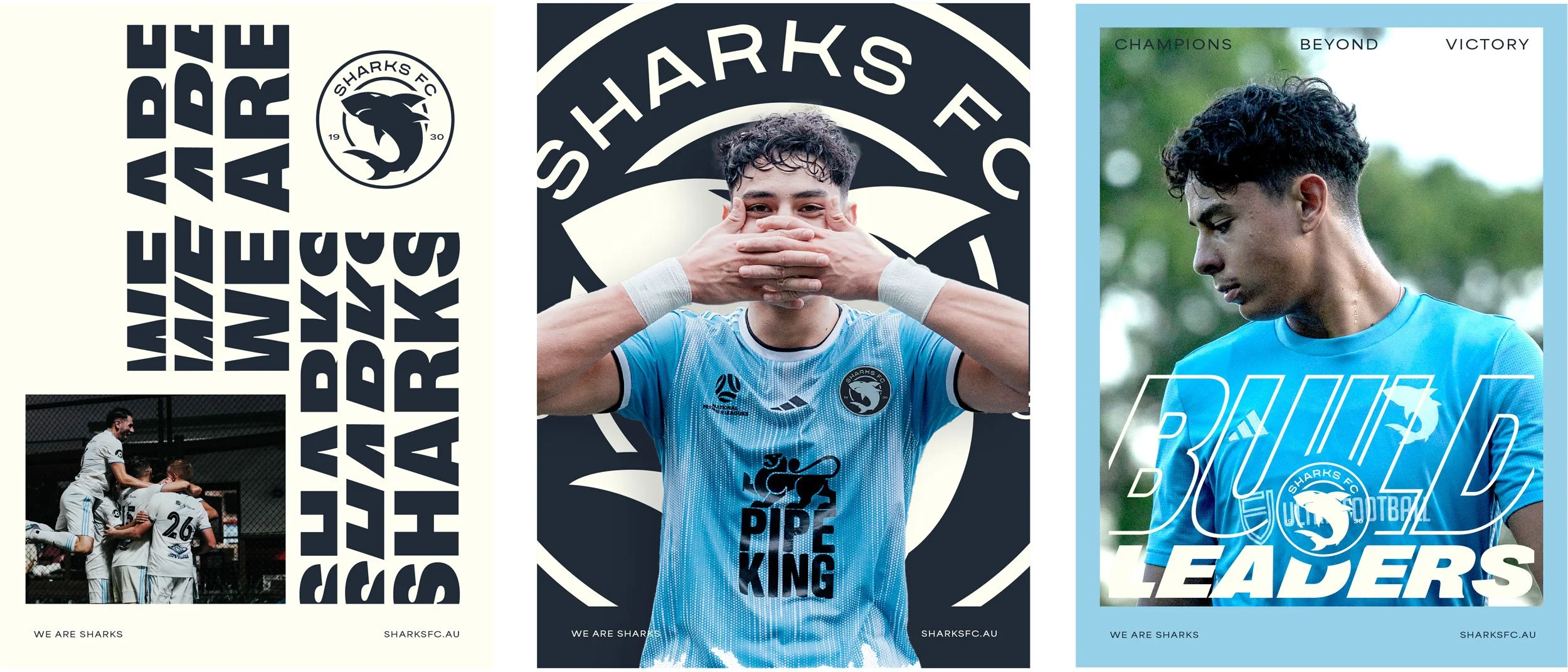
We wanted a brand that mirrored our belief that football is more than a game; it’s a way to shape individuals, instill values and build connections within the community.

We’ve also focused on capturing real moments in our photography—celebrating teamwork, camaraderie, and the passion for the game.
BRAND STAMPS
As part of the rebrand, we’ve introduced a range of graphic elements that celebrate our history, including a nod to our early days as Sutherland Shire Casuals. These designs bring our identity to life in new and exciting ways. You’ll soon see them rolled out across new merchandise.

SHARK REFINEMENT
Subtle adjustments, including the addition of eyes and a mouth, have made our shark emblem more dynamic and powerful.


ROLLING OUT SOON…
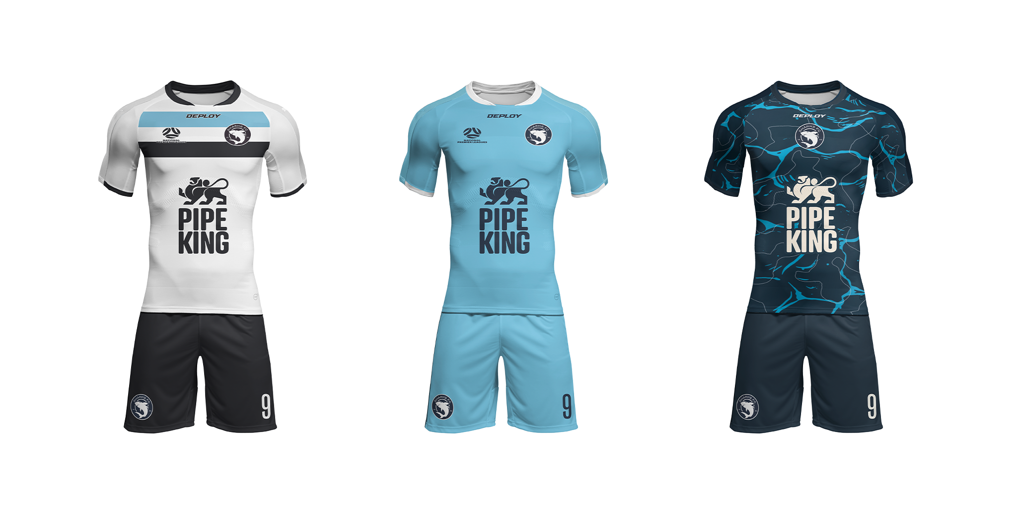
The new Sutherland Sharks FC brand will be rolling out across all our assets in the coming weeks, from our kits and building signage to digital platforms and community engagement. A huge thank you to everyone who played a part in bringing this new chapter to life—we can’t wait to share it with you.